This note records shading technique in drawing. When we think about how to render, light and shadow are unavoidable. Before making anything worthwhile we need to think carefully about these basic skills.
The claim running through this series is that "dark" in a picture is not one thing but three. Value from surface orientation, occlusion where surfaces come close together, and cast shadow where light is blocked β they have different causes, different shapes, and different edge qualities. Blend all three into one grey and the picture goes flat. This note covers the first.
Surface orientation
A very basic concept when rendering is the orientation of a surface. In 3D software we also call this the normal direction.
Looking at a cube, for instance, it is easy to tell which face is the front and which is the top.
For irregular geometry, however, the exact normal direction can be hard to judge. So a sensible strategy is to try drawing all the surfaces visible from the left, from the top, from the right, and so on.
The key here is to sort first and shade second. Beginners usually do the reverse: they start laying in values following the form, so every stroke is simultaneously handling orientation, occlusion and cast shadow β and none of the three ends up accurate. Cut the picture into a few planar groups by orientation, with no variation inside each group, and by the end of that step the picture already has volume.
A few harder cases follow.
Example 1: an interior
Drawing surface orientations might look like this.
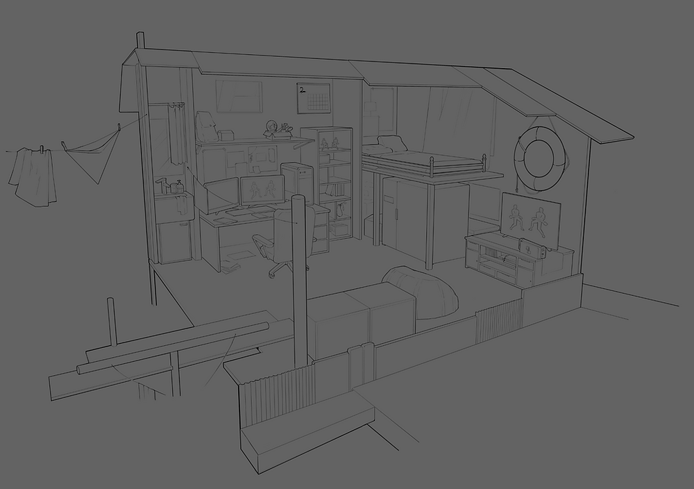
Suppose we have a finished line drawing of an interior.
Assume the face of the television is the front side. Let us block in the following orientation groups.
[ Top ] everything visible from above.
[ Right ] everything visible from the right.
[ Front ] everything visible from the front.
[ Bottom ] everything visible from below.
At this step nothing needs to be blurred. You may choose to soften the edges where an orientation transitions into its opposite, as I did in the fourth image.
Now, by stacking each orientation layer β or simply setting each to 50% opacity β you might get something like this:
The orientations are already distinguished by colour. Even without the line art it reads with a certain realism.
Replacing each colour below with a different greyscale value gives the following image:
As long as the orientation judgements are handled correctly, the result should match exactly what a 3D modelling package would show.
Choosing the greys
Do not pick those greys arbitrarily. Under the most general assumption β sky light coming from above β the order of the four orientations is essentially fixed:
- Facing up is lightest; it sees the largest area of sky.
- Facing the light comes second.
- Facing away from the light third.
- Facing down is darkest; it only receives bounce from the ground.
The spacing between the four values matters more than their absolute levels. Crowd them together and the picture goes grey; spread them too far and it looks harsh. A practical starting point: up 85%, lit side 65%, shadow side 40%, down 25%.
One more thing: downward-facing planes should not be black. They catch bounce light from the ground and usually pick up its colour too. Under the chin, the underside of a table, the inside of an archway β all of them. Painting these black is the fastest way to make a picture look dirty.
Example 2: a character model
Let us take a more complex model β a character. We still only need to distinguish the basic directions.
[ Lineart ]
[ Surface Orientations ]
[ Orientation Overlaying ]
[ Grayscale Color Replacement ]
A character is harder than an interior because the human body has almost no flat planes. The way through is to simplify the curved surfaces into planes first: the head is a box plus a sphere, the ribcage a rounded barrel, the limbs a series of cylinders with changing cross-sections. Sort orientations on those simplified forms, establish the large relationships, and only then go back and round the hard edges off.
Doing it the other way round β starting with soft gradients and then trying to find the structure β almost always fails, because a gradient contains no boundary you can judge.
Why this step earns its place
The output of this step is called a normal pass in 3D and "blocking in the big shapes" in traditional drawing. Its value:
- It depends only on form, not on light. The same orientation grouping works with any lighting scheme.
- It turns "how dark should this be" from a matter of intuition into a question you can answer β if you can say which way the plane faces, you can say which value band it belongs to.
- The other two kinds of dark, occlusion and cast shadow, are multiplied on top of it. Get this base wrong and nothing added later will rescue it.
The next note covers the second kind of dark: occlusion shadow.
